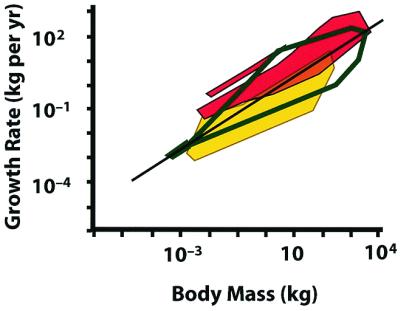
Figure 1.

Comparison of growth rates of trees and vertebrates, plotted on a common scale. Polygons represent the regions occupied by the data points. The dark green unfilled polygon encloses tree data from Niklas and Enquist (7). The endothermic vertebrates—mammals (large polygon) and birds (small polygon)—are in red, ectothermic vertebrates in yellow. Ectotherms and endotherms overlap in a narrow region. The regression line is that presented in ref. 7. Vertebrate data recalculated from refs. 18 and 19.
