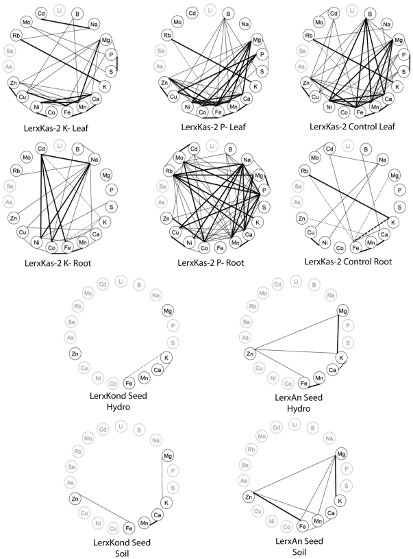
Figure 3. Correlations wheels showing significant correlations between elements within an experiment.
A–F are from Prinzenberg et al. [17], with correlations calculated from the original data. G–J are taken from Ghandilyan 2009, [27], Table 3. Only significant correlations (p<0.001 and R2>0.32) are displayed on each wheel. Positive correlations are denoted by solid lines, negative correlations are denoted by dashed lines. Thick lines indicate R2>0.5, thin lines indicate 0.32<R2<0.5. Ions not measured in a given experiment are colored in grey.

