Figure 4.
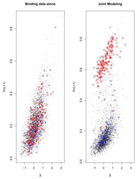
The scatter plots of posterior probability of being binding target genes(P r(Ix = 1))vs mean binding intensities () for using binding data alone model and joint modeling for Lrp data. Each black dot represents one gene in E. Coli chromosome, X-axis represents the observed binding intensities from binding data, Y-axis represents the estimated posterior probability of being binding target genes from either binding data alone model (left panel) or from joint modeling (right panel). The dots with red circles represent the genes with high expression values (). The dots with blue circles represent the genes with high sequence scores (z > −4). In binding data alone model, the estimated posterior probabilities are positively associated with the mean binding intensities, and the posterior probabilities do not depend on the expression data or sequence data. In joint modeling, the posterior probabilities of the genes with high expression values (with red circles) increase compared to using binding data alone; the sequence scores have less effects.

