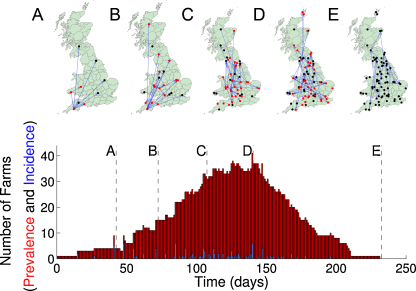
Fig. 1.
Example epidemic for the movement pattern of 2009, showing the state of farms (red, those containing infected cattle; black, those that previously contained infected cattle) at five time points during the epidemic. Blue lines join newly infected farms to their source of infection. The bottom graph shows the time-course of the epidemic, in terms of the number of farms with infected cattle.

