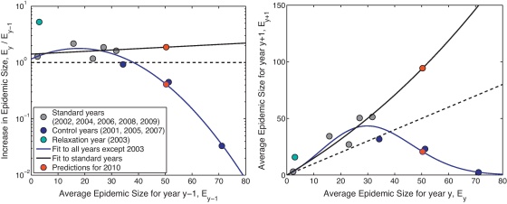
Fig. 4.
Change in epidemic size between one year and the next. The dots represent average epidemic sizes from multiple stochastic simulations for each year starting with 5 cattle infected on a randomly chosen farm (as in the solid lines in Fig. 2); colours represent the regulatory changes in the year: grey is no change, blue is control implemented, cyan is control relaxed. Black and blue lines represent the best fit polynomial curves (as specified by the Akaike information criterion (Akaike, 1974)) to the relative change in epidemic sizes; the black line is a quadratic fit to the grey points, the blue line is a cubic fit to both the blue and grey points. Finally, the red dots show the predictions for 2010 based on the two best fit curves. (A) The relative change in average epidemic size (plotting Ey/Ey−1 against Ey−1). (B) The relationship between the average epidemic sizes in two consecutive years (plotting Ey against Ey−1).

