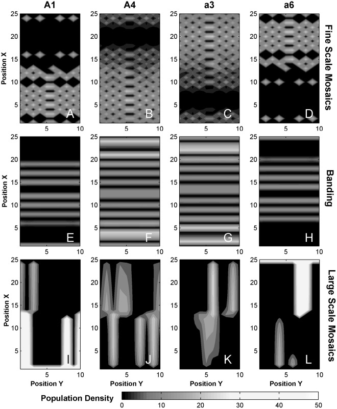
Figure 6. Mosaics and bands.
Representative distributions of phenogenotypes A1, A3, a4, and a6 are shown as contour plots across the grid of patches (x,y) for fine scale mosaics (A–D, Area II, Match), bands (E–H, Area IV, Common), and large scale mosaics (I–L, Area III, Match). For the large scale mosaics, the initial densities for A1 (x = 1) and a6 (x = 25) was drawn from a Gaussian distribution of mean 10 and standard deviation 2. Diffusion and paternal transmission were set to 0.

