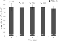
Fig. 4.
The bar graph shows the measurements of TAM for the entire group at each time point. The mean TAM value at TP5 was decreased compared with preceding time points TP1, TP2, TP3, and TP4 after an acute throwing episode. The asterisk indicates significantly greater TAM than TP5. Mean ± SD is provided at the base of each bar in the graph.

