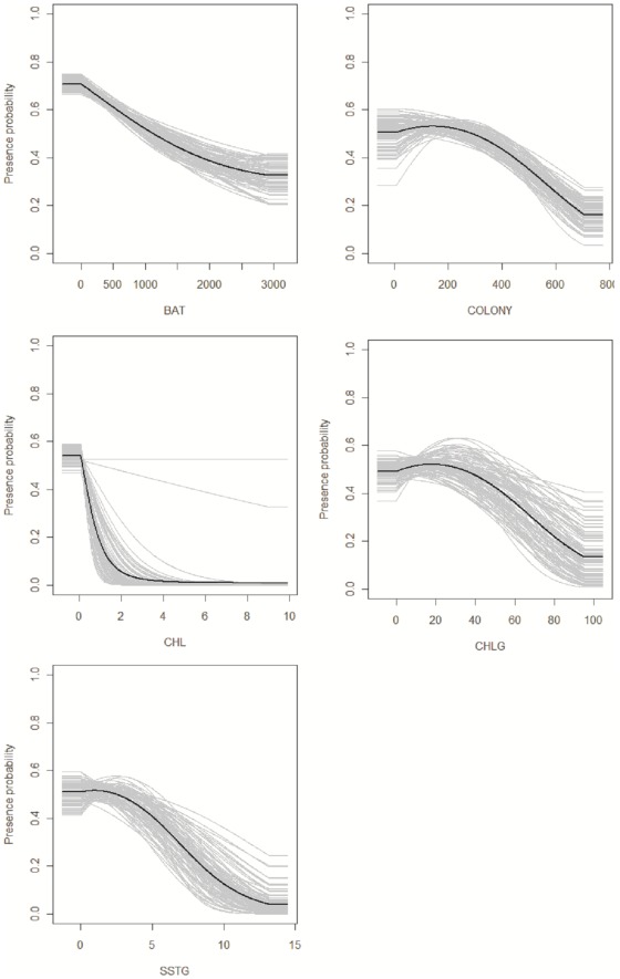
Figure 4. Response curve illustrating relationship of presence probability to environmental variables.
Higher values correspond to higher probability of occurrence. These curves show how the logistic prediction of a particular variable changes, keeping all other environmental variables at their average sample value. Grey lines show the output of the 100 iterations, while the black line represents the mean bootstrap value.

