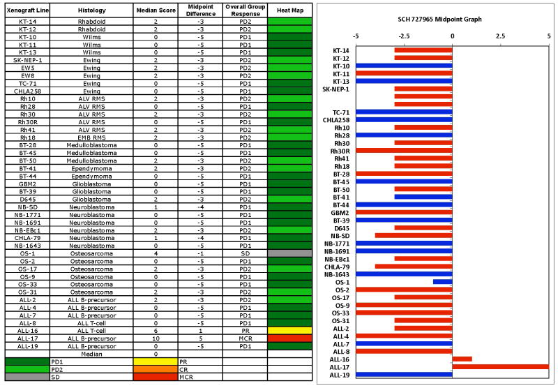
Figure 2. SCH 727965 in vivo objective response activity.
Left: The colored ‘heat map’ depicts group response scores. A high level of activity is indicated by a score of 6 or more, intermediate activity by a score of ≥2 but <6, and low activity by a score of <2. Right: representation of tumor sensitivity based on the difference of individual tumor lines from the midpoint response (stable disease). Bars to the right of the median represent lines that are more sensitive, and to the left are tumor models that are less sensitive. Red bars indicate lines with a significant difference in EFS distribution between treatment and control groups, while blue bars indicate lines for which the EFS distributions were not significantly different.

