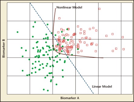
Figure 1.
Simulated data for two biomarkers. Red squares, cases; filled green circles, controls. The blue dashed line illustrates a linear model that combines the two biomarkers to achieve better separation of the two classes of samples than either of the biomarkers used alone. The red line is an example of a nonlinear model that can further improve model performance.

