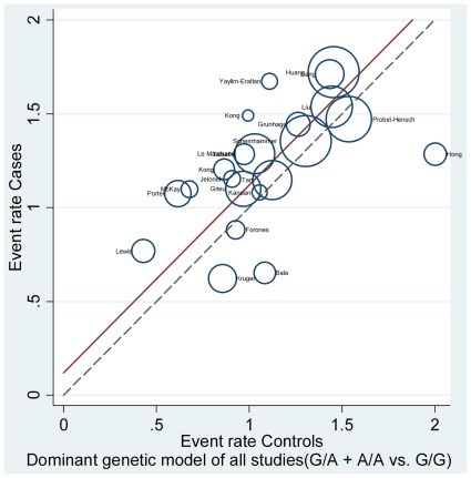
Figure 3. The L’Abbé plot [14] for the assessment of CRC risk in each group (G/A+A/A vs. G/G).
Each circle represents individual trial sizes, and the circles are proportional to the study weights (participant number). The diagonal dotted line indicates that the CRC risk was equal in the two arms within the trials. The solid regression line represented a summary OR of 1.127 (G/A+A/A vs. G/G), which was estimated from the pooled results of all 22 studies.

