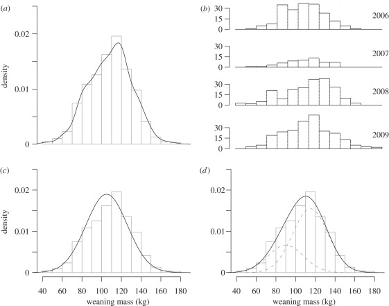
Figure 1.
Distribution of the (a,b) raw data and (c,d) fitted models. The upper panels show the whole dataset (on a density scale, a) and the data broken down by year (on a class-size scale, b). On the lower panel, fitted values from two different models, (c) a GLMM and a (d) HMM (dotted curves represent each component of the mixture) are represented. The mode and the overall shape of the data are better described by a two-component mixture model.

