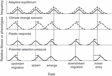
Figure 4.

Hypothetical interaction between shifts in life-cycle timing and shifts in environmental optima. The x-axis (not to scale) represents the time from spawning through ocean entry. Solid bell curves represent the distribution of phenotypes and the dotted curves represent the relative fitness of these phenotypes in the current (top row) and climate-change (second row) conditions. Dashed vertical lines show the current phenotype. The line shifts represent plastic changes in phenology. The upper graph represents an equilibrium condition with the response of the fish adapted to environmental conditions. The second row shows how a hypothetical climate-change scenario might shift the optimal migration timing of each event. The third row shows the likely physiological (plastic) response to warmer temperatures phenology. The bottom row shows the potential evolutionary response to the mismatches depicted in the second and third rows. Note that earlier downstream migration but later ocean entry would seem to present contradictory pressures.
