
Figure 5.
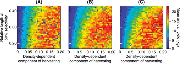
Variation in the mean annual yields for different harvest regimes. The three panels correspond to selectivity curves with increasing steepness: (A) a = 0.5, (B) a = 5.9, and (C) a = 25. The vertical axis shows the length at 50% selectivity, measured as a fraction of the charr's maximum length, while bH, which scales the density-dependent component of harvesting, is shown along the horizontal axis. Mean annual yields are color-coded, with dark blue corresponding to lower yields, while red indicates high yields. Values shown for each harvest regime are means of 15 replicate model runs.