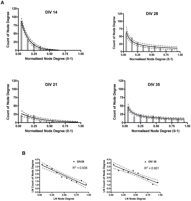
Figure 4. Change in the node degree distribution with culture development.
Node degree distributions, obtained from all the nodes of the persistent networks of all cultures using a bin size of 10%. Panel A: bar graphs represent node degree distributions on a linear scale. Solid lines show the best fitting model at each age, broken lines represent 95th percent confidence interval. Top left: DIV 14, bottom left: DIV 21, top right DIV 28, bottom right: DIV 35. DIVs 14 and 21 show exponential fit on a linear scale, DIVs 28 and 35 show power law fit on a linear scale. Panel B: scatter plots represent node degree distributions on a log-log scale, DIVs 28 and 35 are shown with a linear fit. The fat tailed node degree distribution found at DIVs 28 and 35 is indicative of nodes with a high degree (hubs).

