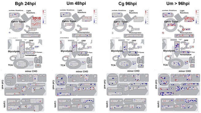
Figure 6.
Visualization of specific transcriptional changes between biotrophy, necrotrophy, and tumors by MapMan analysis. Mean fold change of the transcripts in infected vs. mock treated samples was calculated based on all three replicate experiments per time point and log-scaled data were visualized using MapMan with all filters disabled. Data for established biotrophy (Bgh 96hpi and Um 48hpi), necrotrophy (Cg 96hpi), and Um tumors (Um > 96hpi) are displayed from left to right. The scale bar represents fold change and reaches from −3 (red) to +3 (blue) on the log scale, which corresponds to −8-fold (red) to +8-fold (blue) in the linear scale. Photosynthesis (Light reactions), Calvin cycle, and photorespiration are depicted in the upper panel, glycolysis, TCA cycle, and fermentation are shown in the second tier from the top, cell wall metabolism, and minor carbohydrate metabolism (minor CHO) are represented in the second panel from the bottom, while lipid metabolism is displayed in the bottom panel.

