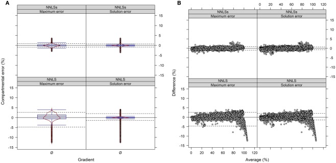
Figure 9.
Diagnostic plots showing the differences in estimated compartmental abundances using (A,B) a three-compartmental estimation strategy based on experimental data. (A) The distributions of observed differences in compartmental abundances are shown as box- and violin plots (red lines). (B) The mean-difference plots depict the differences in dependence of the averages of compartmental abundances. For all graphs the difference in compartmental abundances between BFA and NNLS or iterative (seed-based) NNLS (NNLSs) are visualized based on the mean–average of compartmental abundances for the three independent gradients. The 5th and 95th percentiles are drawn as black dashed lines. Only values are shown if they are considered as sufficiently explained, i.e., TPD ≤ 10% based on the BFA solutions.

