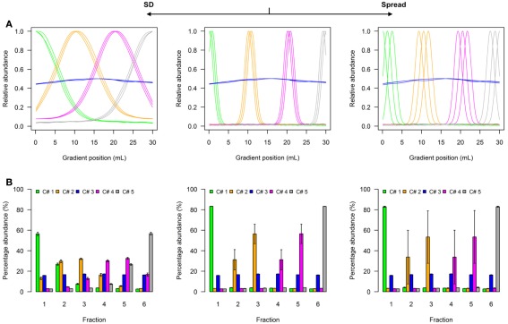
Figure A1.
Simplified scheme of the five-compartmental simulation model. (A) The continuous distributions are depicted by line plots for each of the 5 compartments represented by 3 individual marker distributions. To aid visualization the distributions are scaled to half-maximum (blue-colored compartment) or maximum (all other) observed values. (B) The bar plots show the mean–averaged fraction abundances including SD among compartment-specific markers for each compartment after the continuous distributions were discretized into 6 equally spaced fractions. The left–side graph illustrates the effect of increasing the SD (SD = 5, ms = 0.4), while the right-side graph shows the effect of increasing the marker spread ms (SD = 1, ms = 1.2) compared to a standard (middle graph with SD = 1, ms = 0.4).

