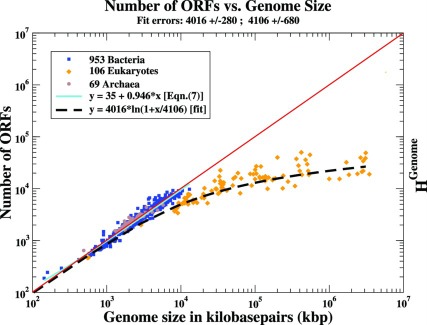
Figure 1. The Number of ORFs in Each Genome vs. Genome Size for the Three Extant Domains of Life on Earth.
The points are data from 1128 genomes available on the GOLD database [3] in early 2010. In this log-log plot, the x-axis represents the genome size (G) in kilobasepairs. For each genome we plot on the y-axis the number of ORFs quoted for the genome in the above database. In order to facilitate comparisons, we have drawn a red diagonal line on a vertical/horizontal scale where 1 vertical axis unit corresponds to 1 kbp on the horizontal axis. The Prokaryotic genomes cluster around this (slope = 1) line. The fit to the Prokaryotes given by Eqn. (6) is represented here as a cyan line. The dashed line represents the best fit to the Eukaryotic ORFs and corresponds to a Benford distribution, Eqn. (11), if we neglect the statistically insignificant contribution from the combination of the first two terms,  . Note the wide range of genome sizes that the fit accommodates. See the Discussion Section regarding the right-hand axis.

