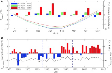
Fig. 3.
Temperature change at the ASRS. a The lines show mean monthly temperature for time periods P1, P2, and P3 (y-axis to the left) between October and May. The bars show monthly temperature anomalies relative to the standard period 1961–1990 for time periods P1, P2, and P3 (y-axis to the right). b The bars show temperature anomalies for ASRS calculated with data collected between October and May, compared to the standard period 1961–1990 (red positive values, blue negative values, y-axis to the left) and the black solid line shows corresponding mean temperature (y-axis to the right). Dashed blue line indicates time periods P1, P2, and P3. Note that the mean monthly temperature for the last time period (red bars, Fig. 3a) showed only positive temperature anomaly values, and that the October–May temperature anomalies (bars, Fig. 3b) for the last time period was almost all above zero

