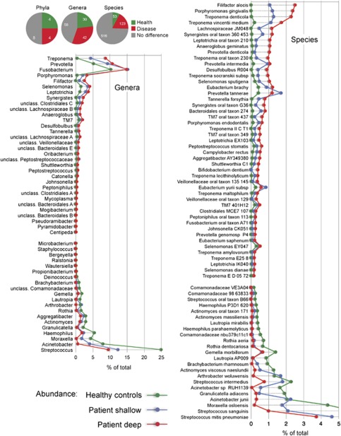
Figure 2.
Differences between health and disease at level of phylum, genus and species. Pie charts show the number of taxa that were significantly different. The graphs show levels for genera that were ⩾0.1% different and species that were ⩾0.2% different in health and periodontitis samples. Taxa were sorted according to magnitude of change. P⩽0.05 after FDR correction for all taxa shown.

