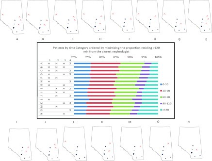
Figure 3.
The implications of adding new facilities (denoted with ^) for the percentage of patients in each travel-time category. The bar graph in the center is rank ordered (from lowest to highest) by the percentage of patients who must travel more than 120 minutes to the practice location of the closest nephrologist. The locations of the proposed facilities are numbered 1 through 4. The different combinations of proposed facilities 1 through 4 are shown in the small maps labeled A through O. Scenario A (four new facilities) has the lowest percentage of patients in the >120 minutes category; scenario N (only one new facility at location 3) has the highest percent of patients in the >120 minutes category.

