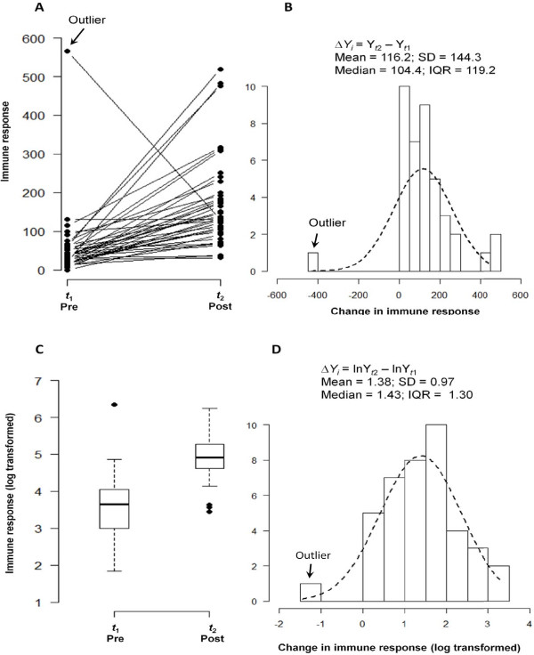
Figure 2.
Line graph of individual trajectories and a distribution of differences. Individual trajectories of change in immune response measurements (Panel A) reflect a general pattern and the degree of similarity among the responses. A histogram of the observed absolute differences in pre-post measurements (Panel B) indicate systematic increase in post measurements, except one case of a negative change, marked as an outlier. The dashed line indicates approximation by a normal distribution. Summary statistics for absolute difference values are shown. The distributions of pre- and post-event measurements (as box plots) and their difference (as histogram) for log-transformed values are shown in Panel C and D respectively.

