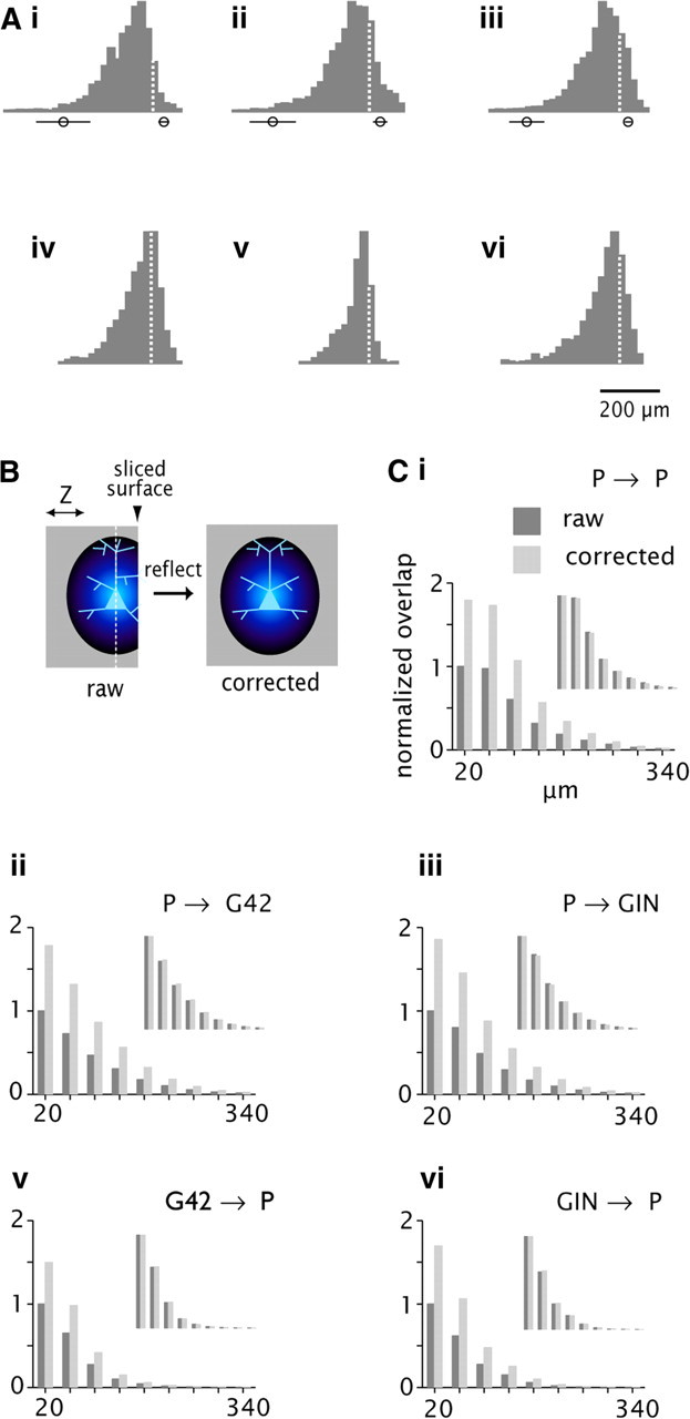
Figure 6.

Effect of slicing on connectivity profiles. Ai–Avi, Normalized histograms of process length density on the z-axis (orthogonal to the cut surface). Data are derived from the density maps in Figure 2B. Dashed lines at X = 0 denote location of the soma. Circles with bars denote the mean and SD of the location of the deep (left) and superficial (right) cut surfaces. B, Schematic diagram of the correction procedure. Blue ovoid denotes the 3-D process length density map, projected here onto the YZ plane. The map is truncated at the cut surface (arrowhead) in the raw data, left. White dashed line denotes XY plane passing through the soma (pale blue). Reflecting around this plane produces the corrected map, right. Ci–Cvi, axonal/dendritic overlap (left axis) versus radial distance (bottom axis) for the raw data corrected (dark gray bars) compared with the corrected (light gray). Scale is normalized to the peak value for the raw data in each panel. Insets, same data with separate normalization for raw and corrected, respectively.
