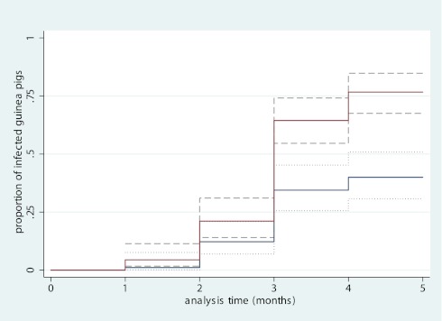
Figure 3.
Kaplan-Meier graph of guinea pig infections. Intervention group (blue line) represents guinea pigs sampling ward air when masks were worn by patients. Control group (red line) represents guinea pigs sampling ward air when masks were not worn by patients. The dashed lines denote the 95% confidence intervals for each line. X-axis shows timing of each monthly tuberculin skin test. Y-axis shows the cumulative proportion of infected guinea pigs at each testing interval.

