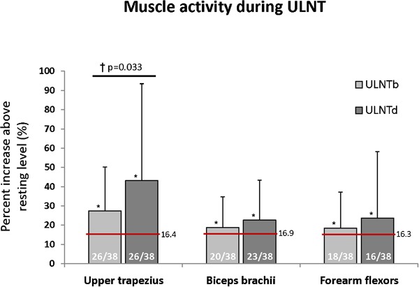
Figure 2.

Muscle activity during ULNT is represented as percent increase above resting levels with error bars representing the SD. The numbers within each bar graph represent the frequency of muscle activity above the threshold (three SDs above resting muscle activity level). The horizontal red line indicates the average threshold for muscle activation. Asterisk (*) indicates significant increase muscle activity above resting levels and cross (†) indicates significant differences between ULNTb and ULNTd (P<0.05).
