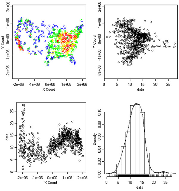
Figure 1.

Data presented are from 2002 EPA monitors. (A) EPA monitoring sites, color coded for annual average PM2.5 concentration by quartile. (B) Scatterplot of the annual average PM2.5 concentrations (presented in μg/m3) plotted against the Y-coordinates of monitor locations. (C) Scatterplot of the annual average PM2.5 concentrations (presented in μg/m3) plotted against the X-coordinates of monitor locations. (D) Histogram of the annual average PM2.5 concentrations (presented in μg/m3). For (A), blue circles denote 1st quartile of PM2.5 concentrations, green triangles denote 2nd quartile, yellow plus signs denote 3rd quartile, and red Xs denote 4th quartile.
