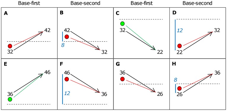
Figure 2. Classification of time-order trials based on the orientation of stimuli.
The reversed presentation order of the same stimuli are in panel pairs: A with B, C with D, E with F and G with H. Each box shows the first vibration (Stim1) followed by an arrow indicting the second vibration (Stim2) to the right. The horizontal dashed line is the global mean of 34 Hz. Green dots (panels C and E) indicate where Stim1 “drifts” towards the global mean, and thus away from the Stim2 representation, classified as a preferred time-order trial. Red dots (panels A, B, D, F, G, H) indicate where Stim1 “drifts” towards both the global mean and the Stim2 representation, classified as a nonpreferred time-order trial. The vertical position of the red and green dots is used here to approximate the perceived frequency of Stim1 after it has drifted towards the global mean. Thus the slope of the dotted green and red lines reflects the difficulty in discriminating between Stim2 and the perceived Stim1. The distance between Stim1 and global mean are shown as blue numbered values referred to in Analysis 4 (panels B, D, F, H). In this subset of nonpreferred trials, some trials are “closer” to the global mean (i.e. 8 Hz) and other trials are “further” from the global mean (i.e. 12 Hz).

