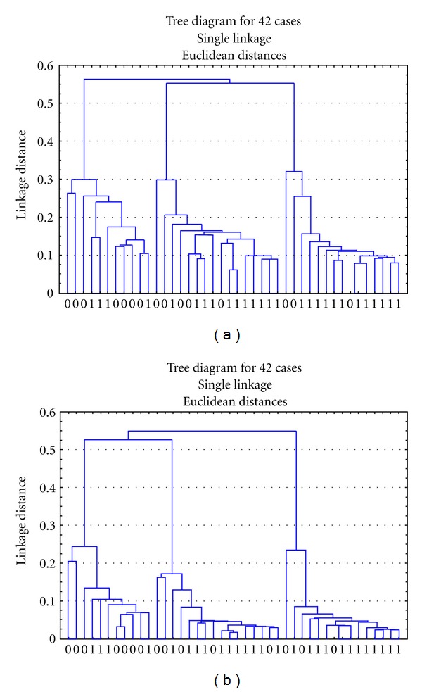
Figure 4.

Hierarchical cluster diagrams of UA patients and healthy controls. (a) is classified by the 20 metabolites in the plasma samples of UA patients and healthy controls, and (b) is classified by the 8 same metabolites. Notes: X-axis represents the sample numbers. Y-axis represents the linkage distance (0 = healthy control group; 1 = UA patients group).
