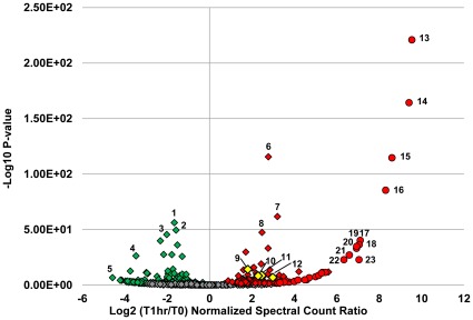
Figure 3. Volcano plot of protein abundance changes during peak infection at MOI = 1.
Normalized spectral counts were averaged between two technical replicates and the log2 ratios taken between time 0 (pre-infection) and 1 hour post infection (peak infection). P-values were calculated using the exact Poisson test as described in the Materials and Methods section. The -log10 of the P-values are plotted on the y-axis. Red color indicates an increase in abundance, green a decrease in abundance, and grey, no change. Diamonds represent host proteins: 1.) glyceraldehyde -3-phosphate dehydrogenase, 2.) pyruvate kinase, 3.) 3-phosphoglycerate kinase, 4.) ribosomal protein S9, 5.) ribosomal protein S8, 6.) ATP synthase, β subunit, 7.) ABC transporter, ATPase, 8.) RNA polymerase, β-subunit. Cas proteins are highlighted in yellow: 9.) Cas6e (CRISPR4), 10.) Cas7 (CRISPR4), 11.) Cas9 (CRISPR1), and 12.) Cas9 (CRISPR3). Phage proteins are depicted in circles: 13. and 14.) head proteins, 15.) scaffold protein, 16.) tail protein, 17.) terminase small subunit, 18.) portal protein, 19.-23.) phage proteins of unknown function.

