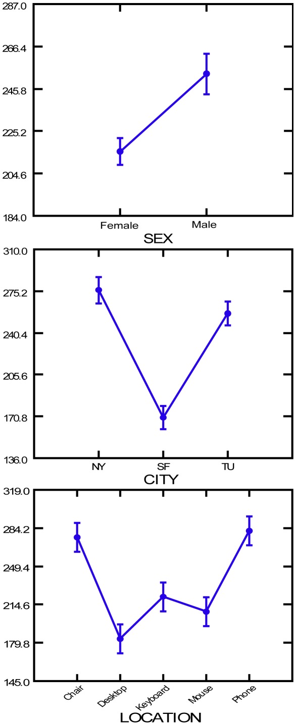
Figure 1. Transition graph showing the average bacterial counts between genders, among cities and among office locations.
The dots indicate the mean bacterial abundance for surfaces grouped by gender of office occupant (top graph), by city (middle graph) and by surface type (bottom graph). The lines connect the means and standard errors for the ranked bacterial counts (see Methods).

