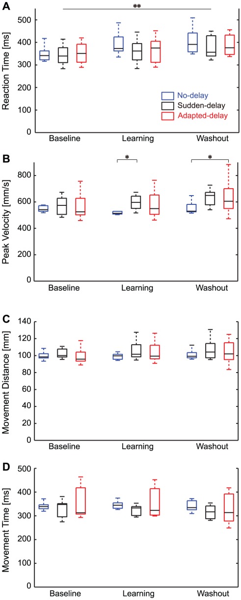
Figure 4. Distributions of movement parameters.
(A) Reaction time. (B) Peak velocity. (C) Movement distance. (D) Movement time. The vertical broken lines at the top and bottom of the box plots represent the maximum and minimum values, respectively. The rectangles represent the inter-quartile range, and the horizontal bars in the rectangles represent the median of each variable. The asterisks indicate a significant difference (*P<0.05, **P<0.01).

