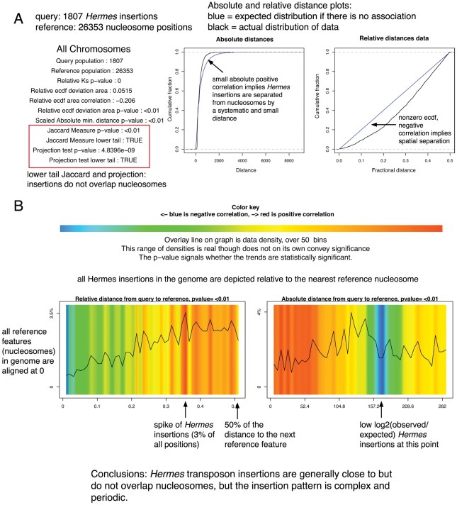
Figure 1. Two types of graphic output are available.
(A) A statistical summary and ECDF plots. (B) A graphical interpretation of the spatial relationships. The query features are depicted along the plot according to their distance to a reference feature; the colors indicate deviation from the expected distribution while the overlay line indicates the density of the data at each absolute or relative distance. The data density mirrors but is independent from the log-odds colors; at small distances in the absolute distance plot the data density is higher than expected but this represents a very small percentage of the total query points.

