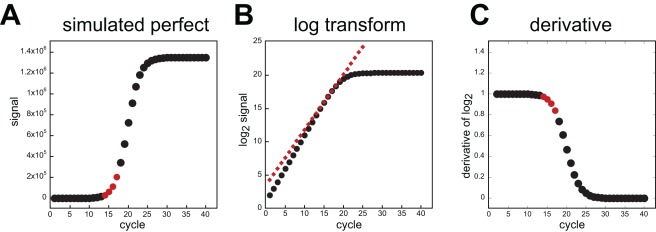
Figure 2. Simulated PCR and cycle threshold analysis.
In panel A, PCR product formation was modeled according to equation 6 with max = 5×10⁶ and Kd = 5×10⁵. Four data points are highlighted that depict the region when the signal reached 1% of the final maximum observed. The data was transformed into log2 and the same 4 points were fit using linear regression. The slope and intercept from that fit were used to construct a straight line that was overlaid onto the log2 plot (panel B, diamonds). Note that the line does not predict the true progression of product at earlier cycles. Also, the earlier a reliable signal can be observed, the more accurate the estimation of the trend is. Panel C, the derivative of the log2 data. A value of 1 means that the efficiency was 100 % and the product doubled during that cycle. The region fitted for the cycle threshold analysis is marked in red and each value is lower than all preceding cycles.

