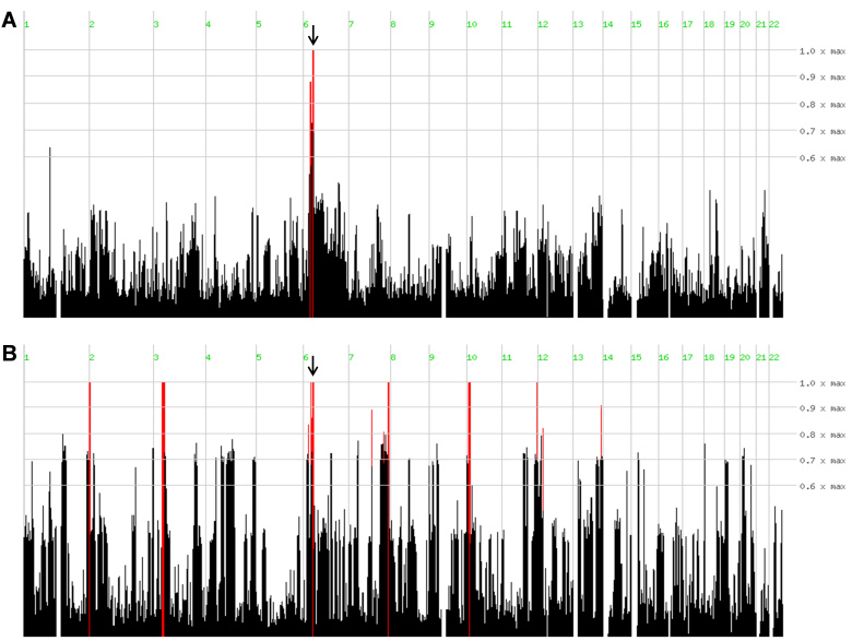
Figure 3.
Homozygosity mapping results for families A and B. Homozygosity-mapper plots show the homozygous regions in the affected individuals in both families (red lines). Homozygous regions that show identical haplotypes for all affected individuals within a family are indicated by arrows. Panel A represents family A and panel B represents family B.

