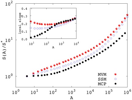
Figure 1. SARs generated by the three models at  (
( for the SSM) using nearest neighbor dispersal.
The MVM and the SSM are simulated on a 1000×1000 square lattice. In the SSM, we chose  and
and  . The MCP is simulated on a 2500×2500 lattice with
  adopting weighted averages (see Fig. 4 and related discussion). In all cases, we averaged over
  independent realizations and statistical errors are smaller than symbols’ size. To ease the comparison, S has been normalized by the average number of species
  at the smallest sampled area. Inset: local slopes
  of the four curves for areas smaller than 104.

