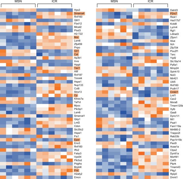
Figure 2. Heatmap of normalized values for the top 100 well-annotated genes from the microarray experiment listed by P-value in order from top to bottom, then left to right.
The lowest P-values are at the top left corner, and the highest are at the bottom right. Blue values represent lower expression and orange values represent higher expression. The names of the genes discussed in the text of this manuscript are highlighted in light orange.

