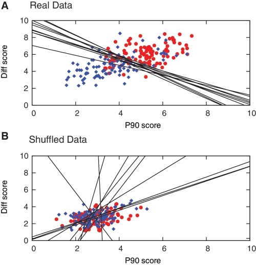
Figure 7.
Categorization of Class I templates (good performers, blue diamond), and Class II templates (poor performers, red circle) using the PWM approach. Plot of PWM scores for Diff and P90 obtained for all test set sequences after 10 iterations based on (A) real data, and (B) shuffled data, along with the classification boundaries (black lines) derived in each cycle. Lower scores signify closer similarity with the characteristics on which the PWMs are based (in this case, low P90 and large positive Diff), therefore Class I templates appear in the bottom left, and Class II templates appear in the top right of the graph.

