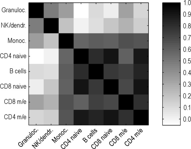
Figure 4.

Heat plot for visualization of the correlation matrix. Higher correlation between independent cell types is depicted by darker squares. Rows and columns are sorted by the mean correlation coefficient per row, which is the same per corresponding column.
