
Figure 3. Dot blots of risk scores for different Clark levels in the training (Panel A) and testing (Panel B) cohort.
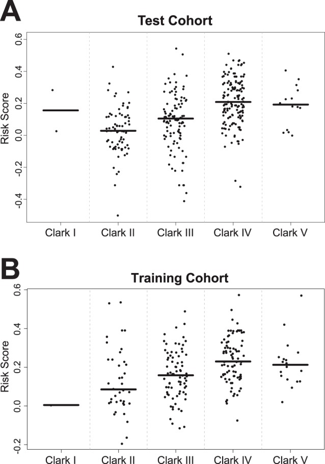
Horizontal lines represent median risk scores for each subgroup.
Official websites use .gov
A
.gov website belongs to an official
government organization in the United States.
Secure .gov websites use HTTPS
A lock (
) or https:// means you've safely
connected to the .gov website. Share sensitive
information only on official, secure websites.
Horizontal lines represent median risk scores for each subgroup.