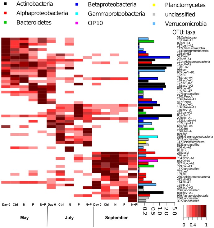
Figure 5. Heatmap visualizing the frequencies of OTUs with a barplot showing their proportions in the entire dataset.
Frequencies are given by relativizing OTUs against their maximum read number. The barplots show the actual abundance (% of all reads) of each OTU with logarithmic scale. Taxonomic affiliation of each OTU is given after the identification number.

