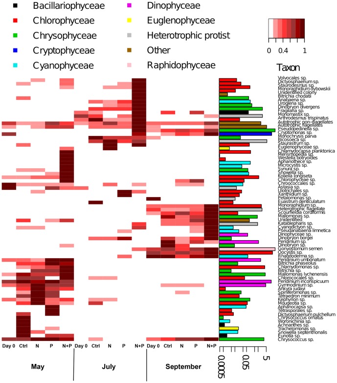
Figure 6. Heatmap visualizing patterns in biovolumes of phytoplankton taxa with the barplots showing their relative contributions to the entire phytoplankton biovolume. Biovolumes were standardized by relativizing each taxon against its maximum biovolume.
The barplots show the actual biovolume (% of taxa) of each taxa in logarithmic scale. * = G. semen contributed 64 % of the whole phytoplankton biovolume in all experiments. To visualize the biovolumes of other taxa, this bar was truncated to same height with the second most abundant taxa, Pseudopedinella.

