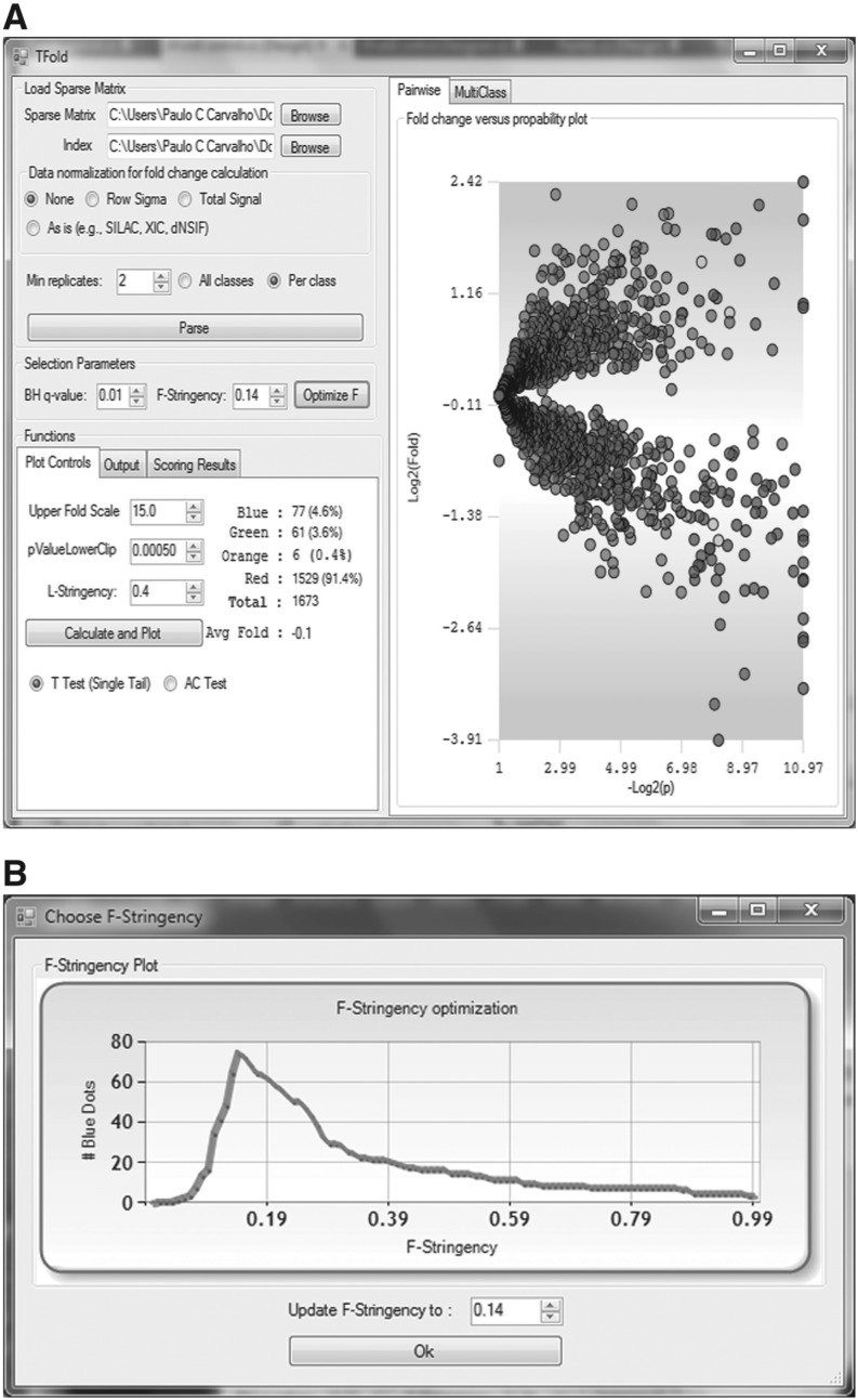
Fig. 1.
Panel A shows the TFold graphical user interface and the results of our updated analysis relative to Fischer et al. (2011). Each protein is mapped as a dot on the plot according to its –log2(P-value) (x-axis) and log2(fold change) (y-axis). Red dots are proteins that satisfy neither the fold-change cutoff nor the FDR cutoff α. Green dots are those that satisfy the fold-change cutoff but not α. Orange dots are those that satisfy both the fold-change cutoff and α but are lowly abundant proteins and thus require further experimentation to certify their differential expression. Blue dots, finally, are proteins that satisfy all statistical filters. Note that the bounds separating green dots from red do not correspond to a single fold-change cutoff (a ‘horizontal’ line) as in the previous approach. Instead, separation is achieved through several cutoffs along a ‘conical’ region (due to the logarithms), one cutoff for each P-value, with vertex at P-value =pmin and Fold change = 1. However, as a consequence of the BH FDR estimator, we have a single P-value cutoff (a vertical line) separating blue and orange dots from green and red in both approaches. Panel B is automatically displayed once the Optimize button is pressed. Given α, it plots the distribution of blue dots as a function of the F-stringency parameter z

