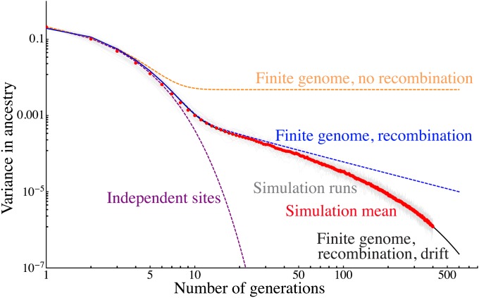
Figure 6 .
Comparison of 50 independent Wright–Fisher simulations of a population of 80 samples and 30% admixture proportion to predictions from increasingly detailed models. We show the variance in ancestry across individuals for each simulation in pale gray, and the average over the simulations is shown as red dots. These are compared to predictions for an independent sites model (purple) for a finite genome with 22 nonrecombining chromosomes (orange), for a model with recombination (blue), and finally for a model with recombination and drift given by Equation 8 (black). The latter model captures the variance in quantitative detail over three qualitative regimes.

