
Figure 3. Population statistics of latency tuning.
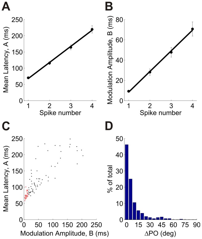
The tuning curves were fitted using a cosine function,  , where θ is the stimulus orientation and ϕ is the latency preferred orientation. (A) Dependence of the mean DC component, A, on spike number (averaged over the population). (B) Dependence of the modulation amplitude, B, on spike number (averaged over the population). Error bars in (A) and (B) represent ±onestandard error of the mean. (C) A scatter plot of A vs. B for first spike latency (each point represents one unit; correlation coefficient 0.85). The cells that are marked in red are onset detectors (see text and Figure 4). The statistical analyses in panels (A)–(C) were performed using dataset 3 in Table 1 (159 cells). Similar results were obtained for the other 4 datasets. The correlation coefficients between A and B were, in decreasing order: 0.88, 0.84, 0.76 and 0.66 (D) Histogram of the difference between the first spike latency-based preferred orientation and the conventional rate-based preferred orientation. In order to avoid artifacts from poorly tuned cells, the histogram shows only cells for which the modulation, B, of the first spike latency tuning curve was larger than 15 ms (∼50% of the cells from datasets 1 to 5 in Table 1).