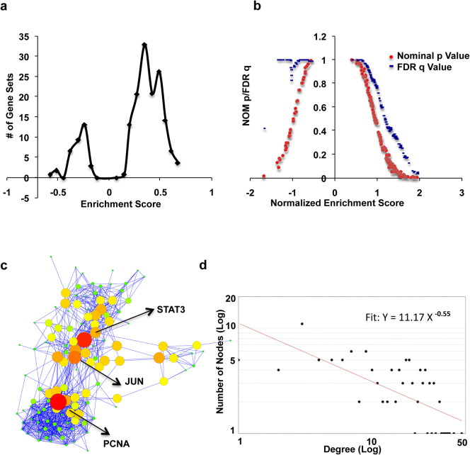
Figure 3. Gene Set Enrichment Analysis (GSEA).
Panel a shows enrichment score (ES) distribution of all the enriched gene sets. Panel b shows variation of p value (Red) and q value (Blue) with Normalized Enrichment Score (NES). Please see text for detail. Panel c is a network of all core enriched genes of all the pathways taken together. Node size is a measure of Betweenness Centrality (BC). Larger is the size higher is the BC. Nodes with highest BC values are highlighted in yellow. Panel d shows degree distribution of network shown in panel c with fitted power law line.

