
Figure 3.
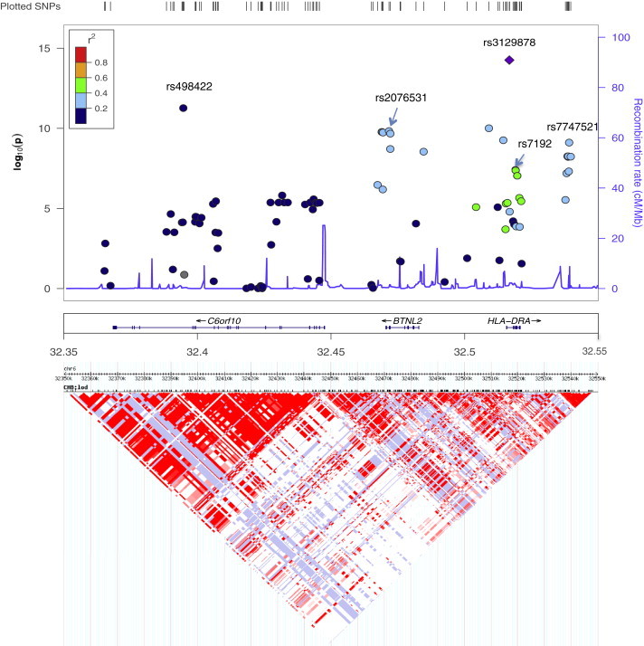
Plots of the 6p22 Region
Top panel: the x axis shows chromosomal positions. The left y axis shows –log10 p values from an association test. Colors of the dots indicate the LD relationship between the most significant associated SNP (rs3129878) and the remaining SNPs in the 200 kb region. The right y axis shows the recombination rate between SNPs.
Bottom panel: Heatmap of SNPs at the region. Both the LD and recombination rates are estimated on the basis of the Hapmap phase II CHB and JPT population.