Fig. 4.
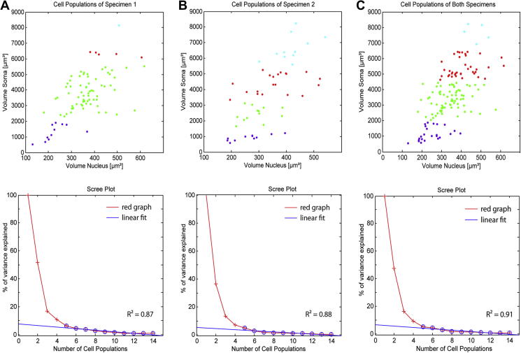
Result of the cluster analysis of reconstructed perikarya from specimen 1 (A, n = 83), specimen 2(B, n = 55) and both specimens (C, n = 138). The scatterplot illustrates arrangement of clusters in a color-coded manner, identified by the agglomerative hierarchical cluster algorithm applied on volumetric data. Purple dots represent the smallest cell population 1 while green and red colored dots illustrate population 2 and population 3 respectively. The biggest cell population 4 is visualized by cyan-colored dots. The screeplot strongly support the determined four cluster solution for each of the three data sets. The red graph presents the calculated percentage of variance explained. For determining the ‘sharp break’ in the scree plot a linear fit (blue line) of the percentage of variance explained was calculated. The “sharp break” was defined at the number of populations where R2 of fitting was ⩾0.8.

