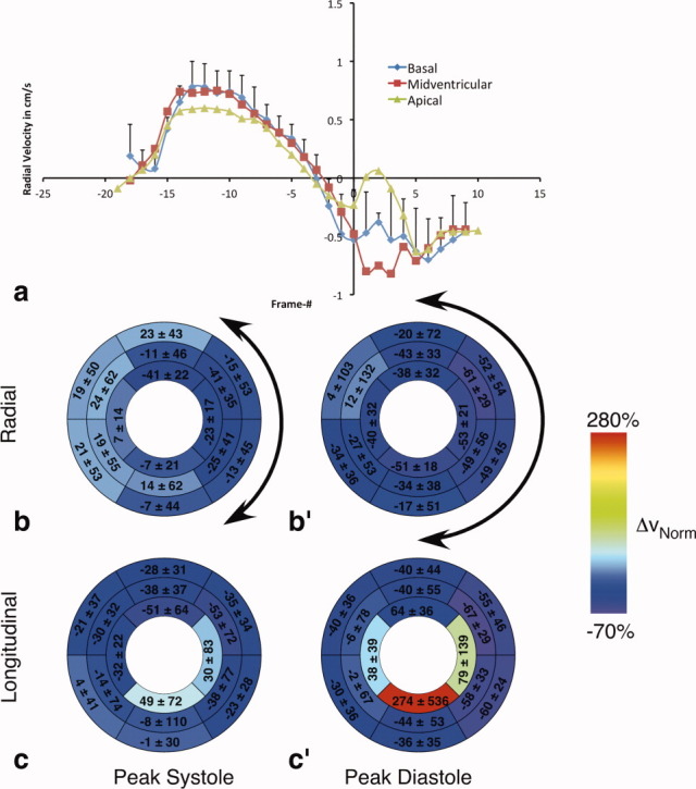
Fig. 7.

Results for the ischemia–reperfusion mouse model. a: Time course of mean radial velocities averaged over all IR mice. Analogously to Fig. 4a, each graph was normalized to end-systole and shows a comparison of data for basal, midventricular, and apical slice locations. The error bars indicate the standard deviation over all mice and are shown for the basal velocities only. Bull's eye plots for normalized (b) radial and (c) longitudinal velocity differences obtained at peak systole (as defined by the maximum velocities during systole) according to the American Heart Association 16-segment model and calculated according to Eq. 1. (b′,c′) Corresponding velocity differences at peak diastole (as identified by the minimum velocities during diastole). The colors encode the average difference (%) between mean peak velocities of IR (n = 5) and control hearts (n = 21) normalized to the control hearts. The numbers correspond to mean ± SD. The arrows in panels (b) and (b′) indicate the injured area, mainly corresponding to the anterolateral/inferolateral sections. [Color figure can be viewed in the online issue, which is available at wileyonlinelibrary.com.]
