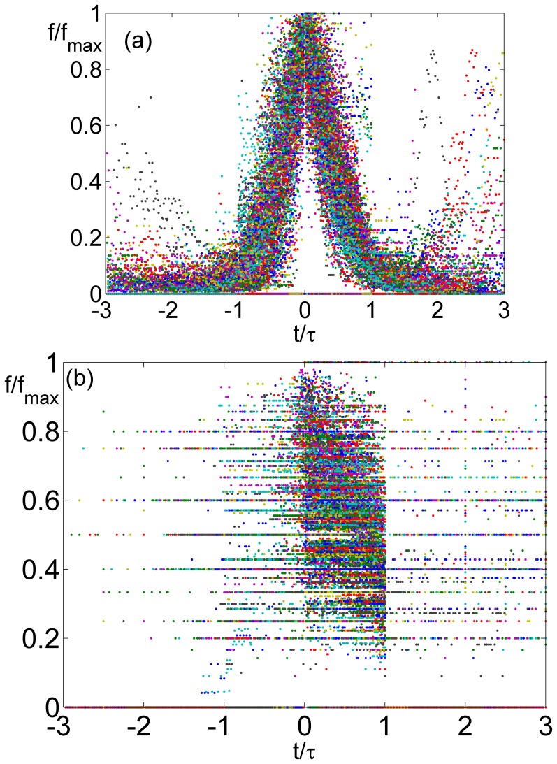
Figure 2. The frequency of all the boys’ first names is plotted in the right panel (a), for each name the frequency is divided by its maximal value and the timeseries were shifted such that the peak of all series appear at zero.
Time for each name was normalized by the width of the peak τ, which is defined as the minimal number of years that takes for the name to fall to 10% of its peak value. The bell shape showing the process of rise and decline, and the “wings” showing reentrance of some names, are clearly seen. None of these is seen for surnames (b) when their abundance is plotted using the same procedure.

